June 2023 News
Jun 2023
The month of June takes its name from the ancient Roman goddess Juno. In Roman mythology, Juno was the queen of the gods, the wife of Jupiter, and the goddess of marriage and childbirth.
June is associated with the summer season in many parts of the world, colours that evoke a sense of warmth, vibrancy, and nature often resonate well during this time. Some popular colour choices for June-inspired interiors may include:
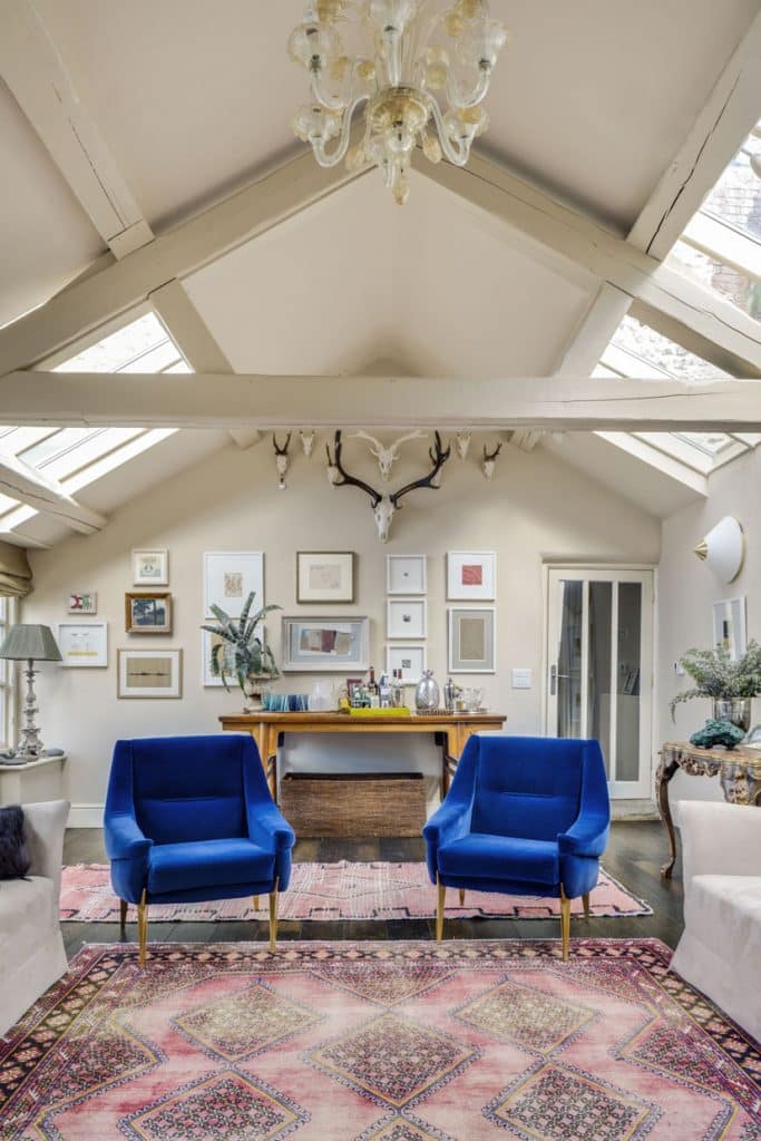
Cool Blues: Light, refreshing blues reminiscent of clear skies and tranquil waters can create a calming and serene atmosphere, just like ‘Freedom’ from the Poison into Medicine Collection.
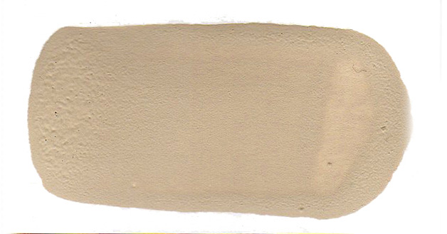
Neutrals with Accents: Incorporating neutral colours such as whites, beiges, and greys as a base and adding pops of bright, bold colours as accents can create a balance between a clean, sophisticated look and a lively atmosphere, resembling ‘Mughal Earth’ from Mughal Spring Collection.
Soft Greens: Shades of green can bring a touch of nature indoors, symbolising lush foliage and the beauty of the outdoors during the summer months, as does ‘Cilantro’ from the Cuban Collection.
Warm Yellows: Sunny yellows can evoke feelings of happiness and energy, reflecting the warmth and brightness associated with the summer season, comparable to ‘Paolo’s Yellow’ from the Original Collection<.

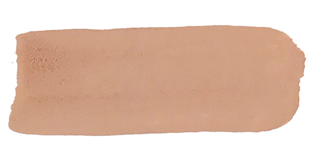
Coral and Peach: These warm hues can add a playful and vibrant touch to interior spaces, similar to ‘Adoration Rose’ Poison into Medicine Collection.
CHOOSING COLOURS FOR YOUR SPACE
Certain seasonal elements can influence interior design choices throughout the year. During the summer season, many people tend to embrace brighter colours, lighter fabrics, and natural materials to create a refreshing and airy atmosphere in their spaces.
Ultimately, the best colour choices for June (or any other month) will depend on personal preference, the desired mood or theme of the space, and how well the chosen colours harmonise with other design elements in the room.
TIP: It’s always a good idea to consider natural lighting, existing furniture and décor, and the overall ambiance you wish to achieve when selecting colours for your interior design.
While it’s natural to draw inspiration from current trends, it’s important to approach colour choices with a long-term perspective. Colours should not be treated as mere trends, but rather as timeless elements that can endure the test of time.
By choosing colours that resonate with you on a deeper level, you are more likely to enjoy and appreciate your surroundings for years to come. Timeless colours allow for a personal expression that transcends passing trends, reflecting your enduring style and taste.
By considering the emotional impact, design continuity, versatility, longevity, and personal expression, you can create a space that withstands the test of time and remains visually appealing and relevant for years to come.
PODCAST CREDENTIALS
I took part in a podcast with the lovely Emma Morton-Turner on Friday 18th May. In 2018 Emma built InsideStylists.com, a community celebrating everything about interiors. She writes regular blog posts and records podcasts all about interior styling, writing and sharing the brands that she loves to feature.
We talked about colours and paints, how I started my career in the world of colour and paint, the importance of a colour consultation and why Francesca’s Paints are different from other paint companies. Listen to the full podcast here.


COLOUR OF THE MONTH
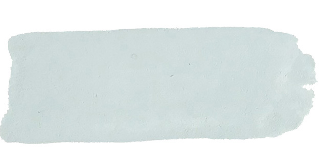
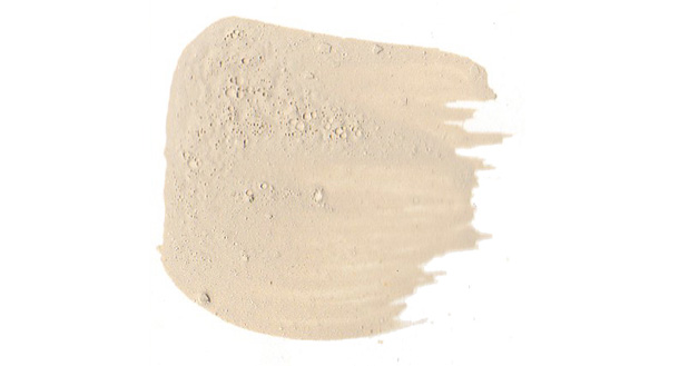
This month is ‘Gianluca’s Fawn’ the most popular colour from the Original Collection, a classic taupe shade. Taupe is a warm, earthy shade, varying in tone from a lighter, greyish beige to a darker, richer brownish grey. Taupe is often seen as a calming and grounding colour, evoking a sense of tranquillity, warmth, timelessness, stability and balance.
FACT: The term “taupe” comes from the French word for mole, which refers to the colour of a mole’s fur.
The colour taupe gained popularity in the world of fashion and interior design during the mid-20th century. It is valued for its versatility and ability to work well with a variety of other colours. Taupe is often considered a neutral colour, as it can be easily paired with both warm and cool tones.
In interior design, taupe is often used as a base colour or backdrop to create a neutral and sophisticated atmosphere. It serves as a versatile choice for furniture, walls, and textiles, as it complements a wide range of other colours and materials. Taupe can add a sense of elegance and refinement to a space, while still maintaining a sense of warmth and comfort.
Have a great June,
Francesca