May 2023 News
May 2023
‘May’ comes from the Latin ‘Maius’, which most likely refers to the goddess Maia. She embodied the concept of growth, both in nature and in business.
This is a month full of possibilities, making us feel alive after winter and full of the joys of spring.
It is the month of the King’s Coronation. It represents a fresh start, a time for new beginnings and renewal.
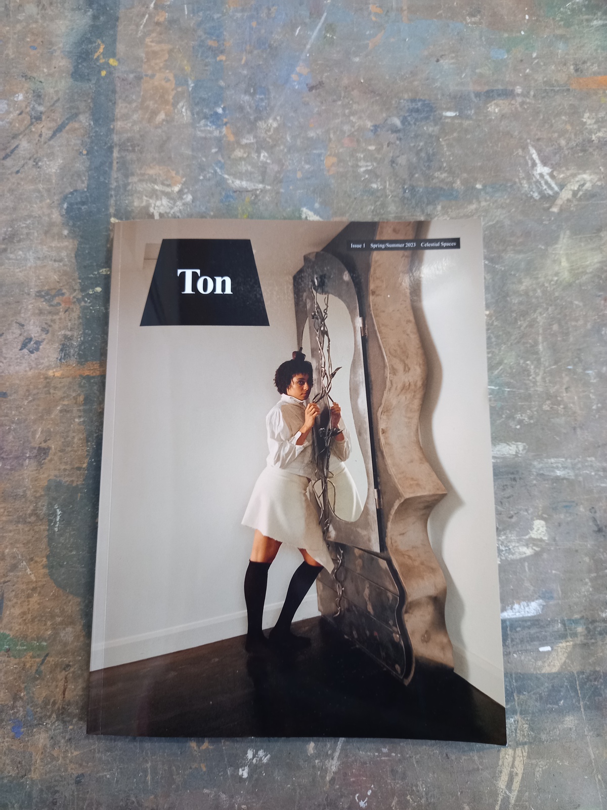
Ton Magazine
A wonderful new Interior Magazine called Ton was launched in the middle of April by the genial and talented Jermaine Gallacher.
The magazine is dedicated to the disruptors of design: the radical makers and tastemakers; the outsiders; people with a point of view, who are doing it their own way. Inclusive not elitist, it is a love letter to the new and diverse voices in interiors; the underground and undiscovered talent; to the spicy, the spiky, the spunky, and the punky. Prepare to be exposed to a very different world of interiors…
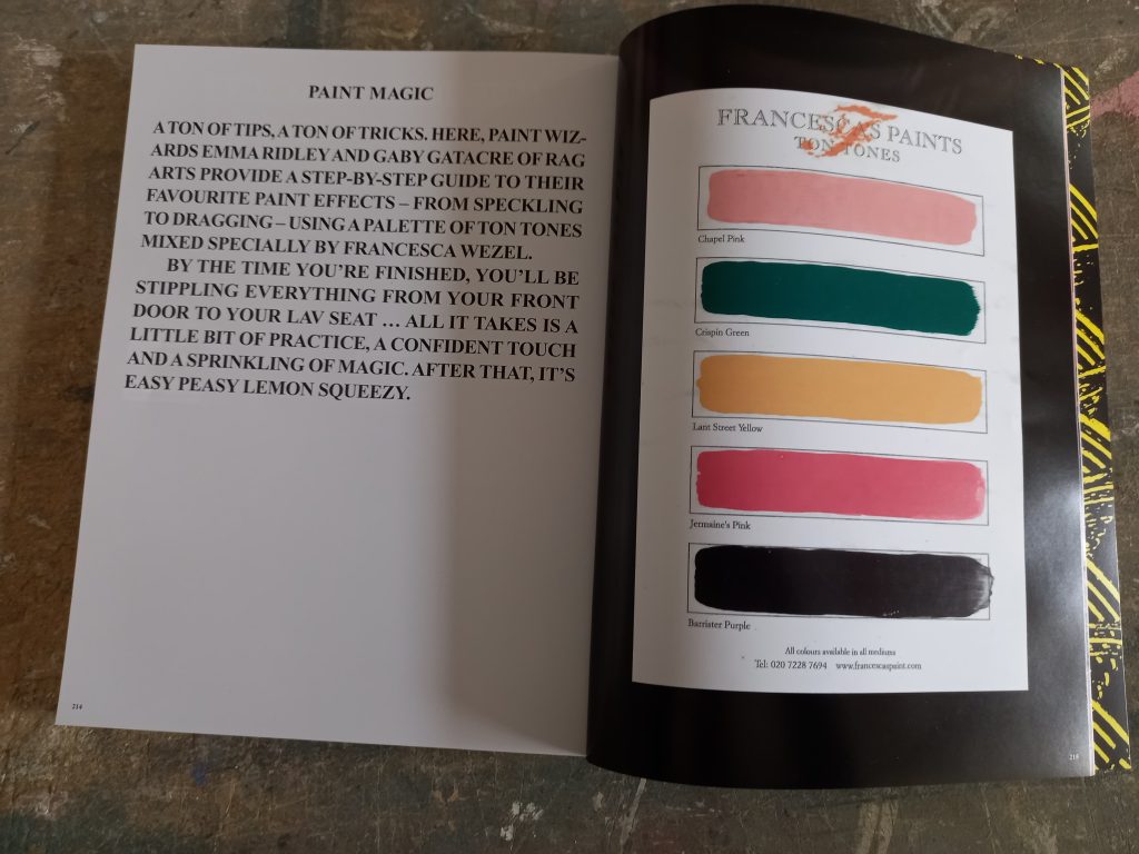
We are so proud and feel honoured to have been asked to produce eight new colours for the first issue, to reflect and set the tone of the magazine. Thank you all at Ton for choosing Francesca’s Paints.

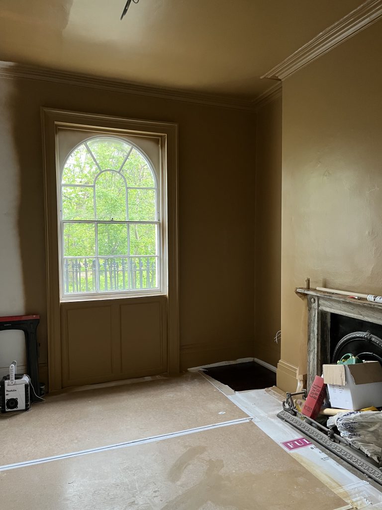
We are also working with Jermaine on several other projects, including an especially wonderful Georgian House in SW1. Working with Jermaine always offers a fulfilling challenge, and great fun too.
His style is unique; his places are like art, he works with the most amazing artisan and craft people with immense talents.
In this project, he chose for the master bedroom ‘Houghton Grey’ from the Houghton Hall Collection, and in the landing ‘Path to Ganga’ from the Himalayas Collection.
Jermaine and I designed a colour especially for this house, an intense nicotine brownie mustard made in our waterbased eggshell. Even though it is a work in progress, it is already looking wonderful. I can’t wait to see the finished project.
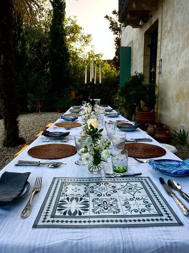
Yoga and Colour Retreat
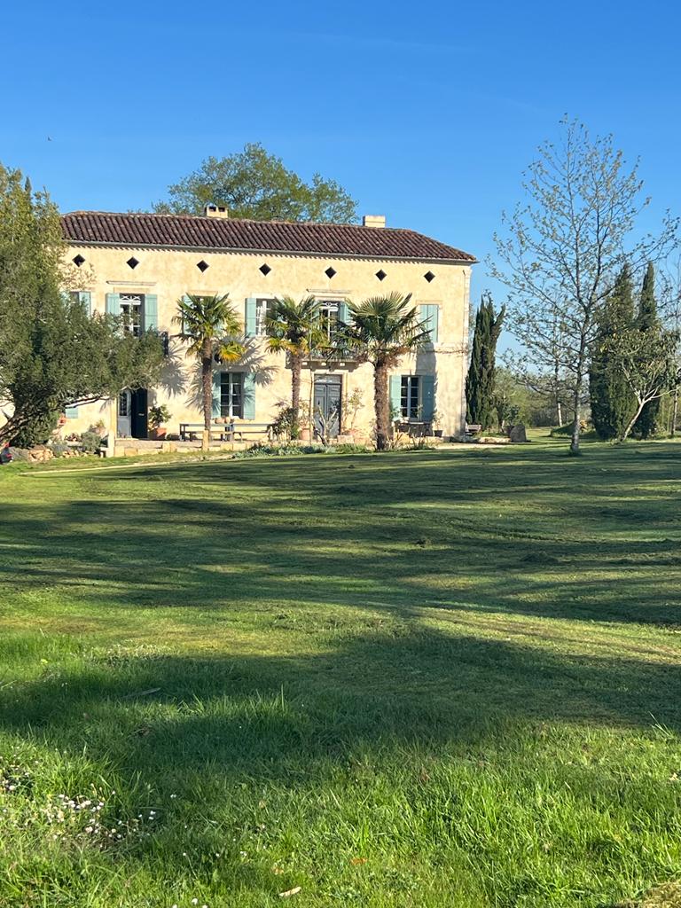
On 10th of May, Miv Watts and I are organising our first Yoga and Colour Retreat, at her house in France for 5 days. I have been teaching Hatha yoga since 2009, and I will be giving the two daily classes in the morning and afternoon. At the time of writing there are still some places available, please visit mivwatts.com/lexis for more information.
The idea of the retreat came about because we are both colour enthusiasts, and Miv’s style and houses are divine, especially Lexis where the retreat is being held. It is the perfect place to chill, do some yoga, eat great food, rejuvenate and relax. The house has been painted with our limewash and it is wonderful.
We thought it was a great idea to combine colour and well-being with the mental and physical benefits of yoga. We will be talking about colours, their meaning, how to choose them and make them flow when we decorate our homes. Miv will give us some incredible insights of how to make a house feel like home, because she is a real expert.
Miv and I met in 1997, she is an Interior Designer with an incredible style. We have been working on many amazing projects together since then, from the Marquess of Cholmondeley’s Palladian Home at Houghton Hall in Norfolk, the Earl of Leicester’s stately home in Holkham, two unique boutique hotels and several country houses in London and the South of France.
We created some of our nicest collections together; Houghton Hall Collection, Solace Collection and The Tin Shack Collection. We both lived in Australia and felt a great connection with it, so we based The Tin Shack Collection on the wonderful landscape around Byron Bay where Miv had an exquisite house on a hill overlooking the ocean.
The Houghton Hall Collection was created after we were given access to some 18th Century fabric scraps from the Houghton Hall archives, and we were allowed to use their historical names, like ‘Walpole’ and ‘Sassoon’. Some of our best-selling colours are from this collection, like ‘Ice House Blue’, ‘Saracen Gold’ and ‘Pumproom Rust’.
The Solace Collection is inspired by the colours of Norfolk where Miv lived for a long time. She created a lovely poem which incorporates the name of each colour and can be read left to right on the Colour Collection chart.
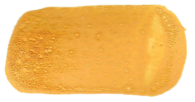
Colour of the Month
‘Tobacco’, from the Pale Collection, has been the most popular colour this month. It is a soft, playful yellow, made with yellow ochre, burnt umber and organic red.
Yellow is a vibrant colour, full of energy, it is the colour of the sun and the core of flowers. It is the colour of light.
Yellow is a colour that is perfect for optimistic people and joyful rooms. In interior design, yellow will energise and uplift the mood of the room.
![]()
This is all for now, we will carry on busily mixing our beautiful colours and paints. We are proud and happy that we are going strong, despite the grand competition, and don’t take this for granted.
We still believe in and love what we do – and that is a very lucky and beautiful thing to be able to say. We feel the love and appreciation from our new and existing customers and thank you all for this.
Till next month, be happy, stretch and enjoy the colours that nature is providing right now.
Francesca
The Studio will be closed from 10th to 14th May whilst I am at the retreat, reopening again on Monday 15th.